
The challenge
USAJOBS is the federal government’s job board with over six million active job seekers. With an average of 28,000 jobs posted any given day, job seekers needed help finding relevant jobs. But the search experience was overwhelming for many users, especially those unfamiliar with federal hiring. Surveys and analytics told us:
Searches returned too many results and most weren’t relevant.
Filters and search-related features were confusing and under-utilized.
“Most of the time there are only one or two results that are relevant and then pages of things that don’t match. ”
Before:

After:

The approach
Making design changes to USAJOBS comes with its challenges:
Strict federal hiring policies
Mandated integration with any applicant tracking system agency employers choose to use
Plus, we were in a presidential transition which brought policy shifts and scrutiny from new leadership. It was crucial that we secured buy in from policy stakeholders and leadership.
A workshop helped us narrow the focus to quick impact changes.
The project kicked off with a discovery workshop led by my design manager. She brought together 30 stakeholders from policy, engineering, HR, and product in person. We identified business goals, gathered constraints, and brainstormed on survey findings.

Focusing on usability, not just the backend
We found that it wasn’t just the search backend that was the problem. Simple usability issues were preventing users from inputting successful search terms and choosing relevant filters. So while the development team worked on the search backend, I focused on usability fixes that could influence user behaviors.
We made sure to include all the stakeholders.
I secured buy-in from key stakeholders by presenting design work and usability test findings to an HR policy working group and USAJOBS leadership. I also kept my cross-functional teammates in the loop by hosting synthesis workshops and regularly presenting to developers, BAs, and the product manager.
-
As one of two product designers on the team, I co-led the design process and usability testing with another designer.
We worked with a content strategist, our cross-functional product team, and stakeholders from across the U.S. Office of Personnel Management.
-
The skills I used in this project include usability testing, interaction design, visual design, workshop facilitation, stakeholder engagement, and development documentation.
-
The tools I used include Figma, Miro, Powerpoint, and Excel.
The solution
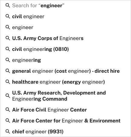
A more helpful keyword search
I redesigned the autocomplete so suggestions appear as soon as the user taps the field. I cut the list of suggestions from 20 to 10, reordered by relevance, and worked with a content strategist to make the search field label clearer. I also added recent and popular searches to help users overcome the “blank page” paralysis that we heard about in usability testing.

Before:

After:
Mobile-first interactions
Throughout the redesign, I replaced dropdowns with bottom sheets to reduce errors and enlarged touch targets.
Before:

After:

Before

After:

A location mode filter up top
I added an on-site/hybrid/remote filter to the search fields so users could see both local and national results at the same time. This also helped us communicate an important policy change: the number of remote jobs had become very limited.
Before:

After:

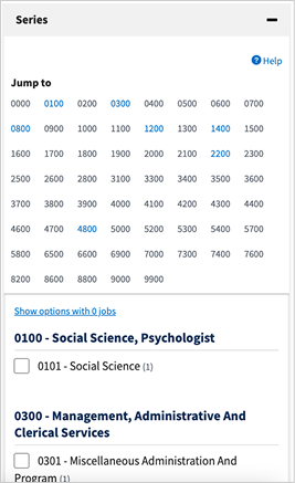
Streamlined filter categories
I simplified categories, reducing number from 12 to 7.
I changed filters from accordions to pills/chips, moving all filters above the fold on mobile and desktop screens.
I added plain-language labels, lowering reading level of filter labels by 8 grades.
Before:

After:

Simpler filter and sorting interactions
I simplified sorting menu, reducing options from 15 to the 3 and making labels more clear.
I redesigned the interactions within 5 filter menus using U.S. Web Design System components, making them simpler to use and maintain.
Before:
After:

Before:

After:

A one-step flow for setting filter preferences
I redesigned the filter preferences feature by replacing a multi-step process that took users away from their search results with a single button.
Task completion for setting preferences rose from the worst performing task to 100% success in usability testing.
Before:
After:
A more visible job alerts feature
I redesigned the look of the “job alerts” feature by making it stand out more.
We renamed it from “Save this search” to “Turn on job alert,” which better matched user expectations.
Before:

After:

The results
The redesign will fix issues described in 50% of USAJOBS’ negative survey responses (based on 914 negative responses over a 3 month period).
Two rounds of usability testing showed improvements in completion rates for all tasks.
The redesign secured approval from the new agency leadership and has become the top roadmap priority for USAJOBS.
All design changes are feasible without impact to the integrated systems that agencies use, which will speed up the development process by at least six months.
“This new design is easier for someone coming from outside government. ”